Google Data Studio—or Data Studio—is a data visualization tool that helps you turn data into a meaningful story. It offers a user-friendly interface, a drag-and-drop feature, and integrations with many marketing platforms. That’s why Data Studio is a no-brainer for marketers who want to present their data but have little to a bit of SQL knowledge. To help you evaluate Google Data Studio, we’ll discuss its pricing in this post.
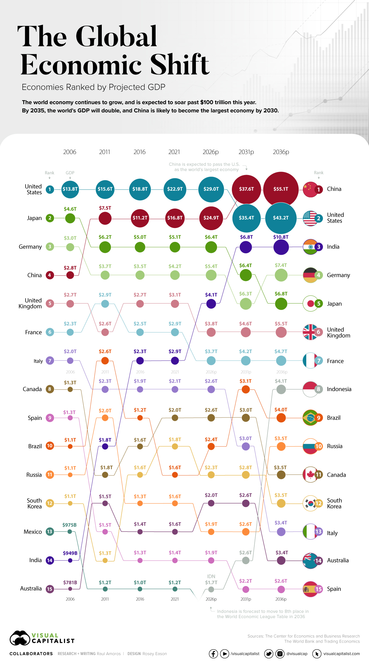
As the post-pandemic recovery chugs along, the global economy is set to see major changes in the coming decades. Most significantly, China is forecast to pass the United States to become the largest economy globally. The world’s economic center has long been drifting from Europe and North America over to Asia. This global shift was kickstarted by lowered trade barriers and greater economic freedom, which attracted foreign direct investment (FDI). Another major driving factor was the improvements in infrastructure and communications, and a general increase in economic complexity in the region.
Imagine spending countless hours analyzing your data and finding a meaningful insight that can help shape direction of your business – the only missing piece is convincing functional stakeholders that your analysis is in fact valuable. In this article we will discuss learning resources offered by leading tools that help us communicate our data findings. In fact, no analysis no matter how thorough and complex it might be could yield any real value if the compelling recommendation is not provided to help company leadership take further action.
The key to good reporting is making sure your data elicits the thought, implication, or decision that you want to leave the reader with. To do that, you'll need to make smart choices in how you choose and display your data. Here's how.
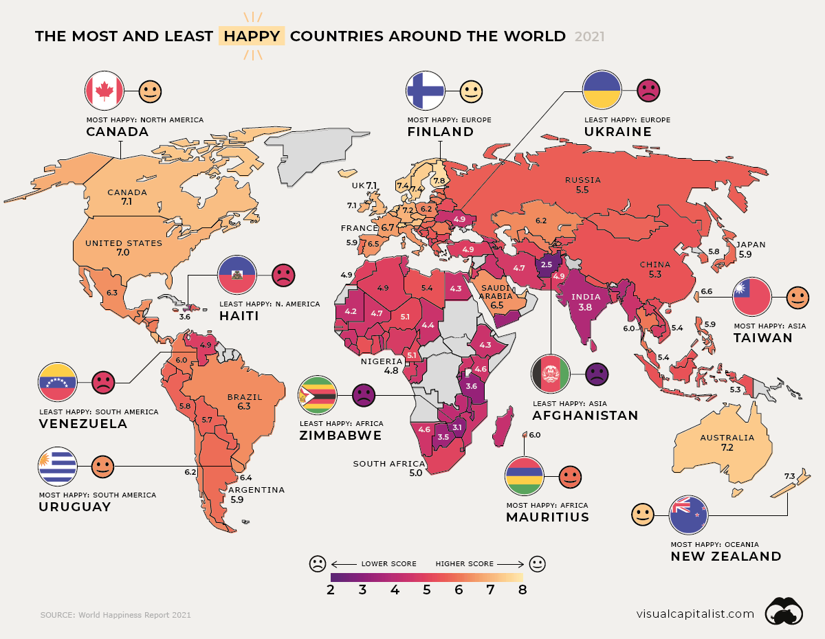
Global happiness levels are determined by many diverse factors. These maps look at the happiest and unhappiest countries in every region. The post Mapped: Global Happiness Levels in 2021 appeared first on Visual Capitalist.
Data science is all about extracting the information from the data gathered. As data has become one of the essential entities in today's world, it drives substantial business profits. It also inspires many to launch their startup based on the assessments they perform of the user interests. While it seems a simple option to get started with, converting the data into something useful is not that simple.
Have you ever got confused by reading those large data tables? Don’t worry, that happens with everyone (including me)! With around 2.5 quintillion data being generated each day including Text Messages, Emails, Videos, Images, etc. it becomes difficult to analyze all these data and find insights from those data. FYI, The cardinal number of quintillion is 1018
In applied Statistics and Machine Learning, Data Visualization is one of the most important skills. Data visualization provides an important suite of tools for identifying a qualitative understanding. This can be helpful when we try to explore the dataset and extract some information to know about a dataset and can help with identifying patterns, corrupt data, outliers, and much more. If we have a little domain knowledge, then data visualizations can be used to express and identify key relationships in plots and charts that are more helpful to yourself and stakeholders than measures of association or significance. In this article, we will be discussing some of the basic charts or plots that you can use to better understand and visualize your data.
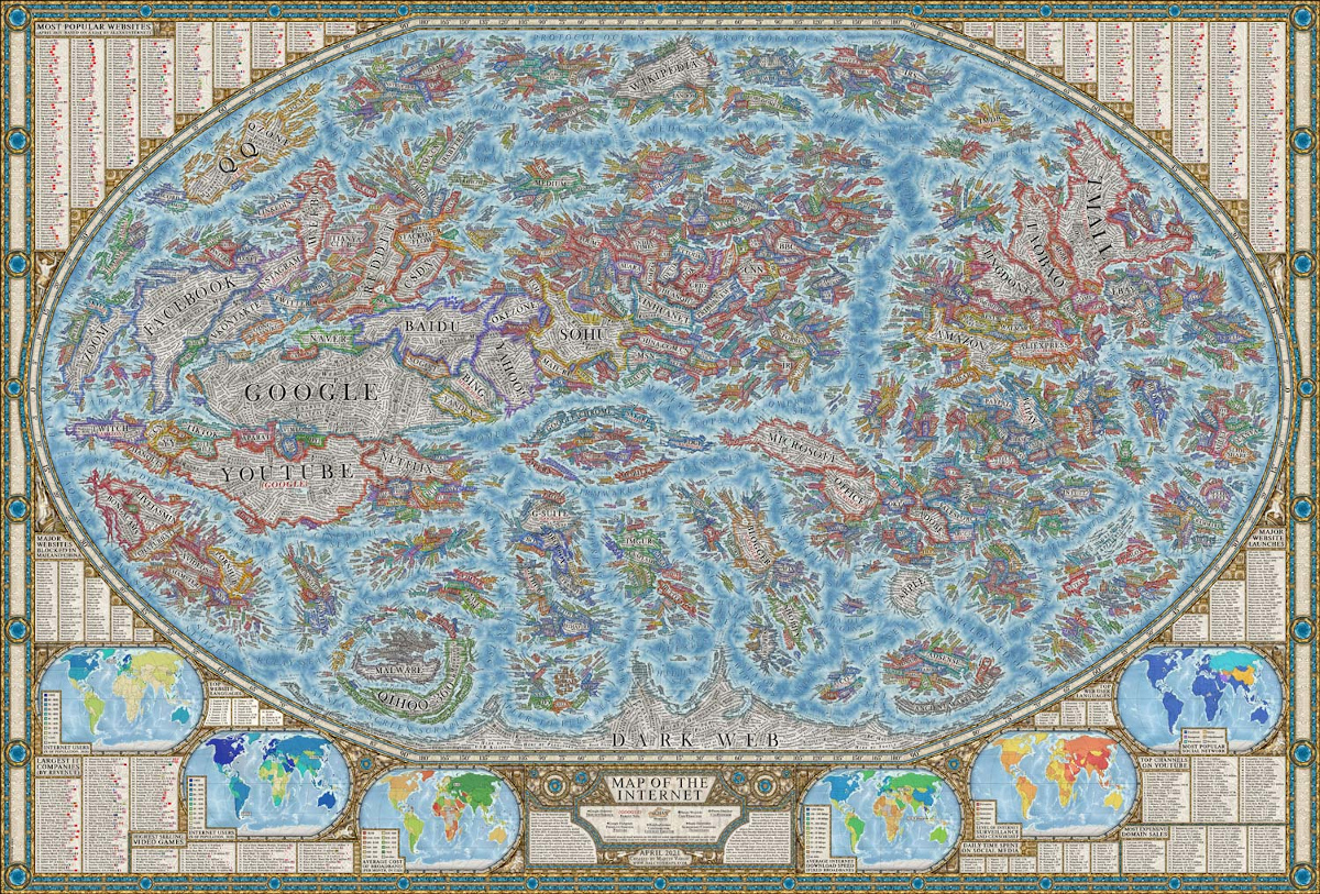
The internet is intangible, and because you can’t see it, it can be hard to comprehend its sheer vastness. As well, it’s difficult to gauge the relative size of different web properties. However, this map of the internet by Halcyon Maps offers a unique solution to these problems. Inspired by the look and design of historical maps, this graphic provides a snapshot of the current state of the World Wide Web, as of April 2021. Let’s take a closer look!
Use interactive charts to explore a deeply-nested inflation datasetShowing data broken down into categories is quite easy — just use a humble bar chart or pie chart (although there’s a 100-year old debate about which is best). But what if each category has sub-categories? And those sub-categories have sub-sub-categories? This is a common data pattern found in many domains including filesystems, biology, and economics.
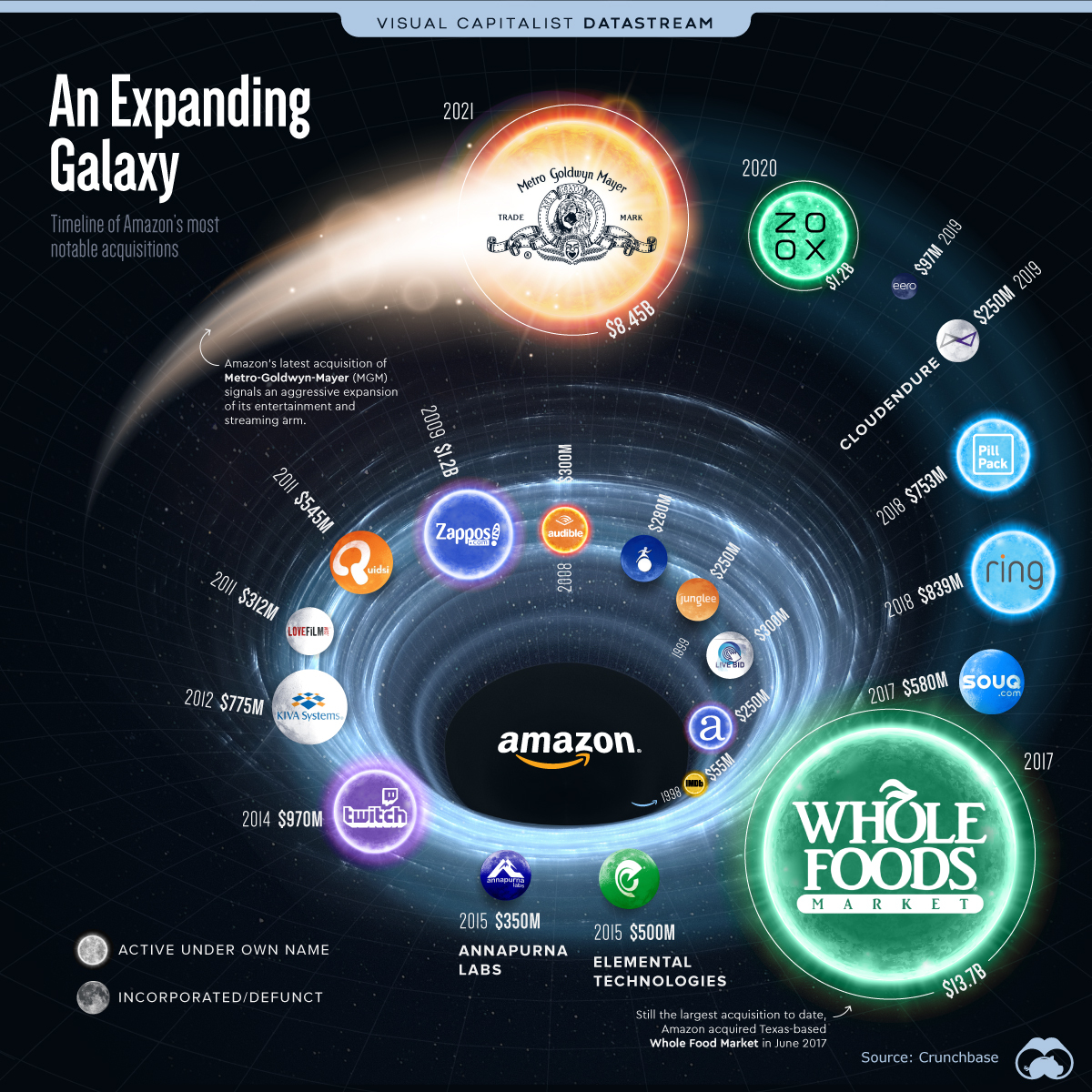
Amazon plans to acquire Metro-Goldwyn-Mayer (MGM) for $8.45 billion This move would add 4,000 films and 17,000 TV shows to Amazon Studios’ content library On May 26, 2021, Amazon announced its plan to acquire Metro-Goldwyn-Mayer (MGM) studios for $8.45 billion, making it the company’s second largest acquisition to date. Amazon has acquired multiple companies across a variety of sectors from healthcare to entertainment, helping diversify its core revenue. In total, the tech giant has acquired or invested in over 128 different companies over the last 20 years.
Nowadays, businesses have to rely on data in unprecedented ways. In fact, businesses hailing from various disciplines use massive amounts of data on a daily basis. They gather data from several sources, offline and online. However, it is also important to compile and process that data and analyze it using apt software solutions. That is why Data visualization applications are used by so many companies. From technology giants to leading MNCs, plenty of companies are relying on BI and data visualization solutions like Microsoft Power BI. For effective Power BI implementation, hiring a veteran development agency is recommended.
Throughout the pandemic, Tableau has partnered with experts and organizations to help people around the world see and understand global COVID-19 data. With 400 million views and counting, our COVID-19 Data Hub has helped governments and organizations inform and guide decision-making. So when our team got the data set for this year’s Gartner BI Bake-Off—COVID vaccine data—we were prepared. I proudly represented Team Tableau at the virtual BI Bake-Off to face off against other analytics platforms. Check out our five #TableauTips on how we used data storytelling, machine learning, natural language processing, and more to show off the power of the Tableau platform.
Creating grand charts and graphs from your data analysis is supported by many powerful tools. However, how to make these visualizations meaningful can remain a mystery. To address this challenge, Microsoft Research has quietly open-sourced a game-changing visualization platform.
Data visualization is one powerful arsenal in data science. Visualization simply means drawing different types of graphics to represent data. At times, a data point is drawn in the form of a scatterplot or even in the form of histograms and statistical summaries. Most of the displays shown are majorly descriptive while the summaries are…
We use cookies on our website to give you the most relevant experience by remembering your preferences and repeat visits. By clicking “Accept”, you consent to the use of ALL the cookies.
This website uses cookies to improve your experience while you navigate through the website. Out of these, the cookies that are categorized as necessary are stored on your browser as they are essential for the working of basic functionalities of the website. We also use third-party cookies that help us analyze and understand how you use this website. These cookies will be stored in your browser only with your consent. You also have the option to opt-out of these cookies. But opting out of some of these cookies may affect your browsing experience.
Necessary cookies are absolutely essential for the website to function properly. This category only includes cookies that ensures basic functionalities and security features of the website. These cookies do not store any personal information.
Any cookies that may not be particularly necessary for the website to function and is used specifically to collect user personal data via analytics, ads, other embedded contents are termed as non-necessary cookies. It is mandatory to procure user consent prior to running these cookies on your website.